[syndicated profile] languagelog_feed

Posted by Victor Mair

Sino-Platonic Papers is pleased to announce the publication of its three-hundred-and-eighty-first issue:


“Relations Between Greece and Central Asia in Antiquity: An Examination of the Written Sources” (pdf) by Yu Taishan.
PREFACE

The eastward expedition of Alexander the Great of Macedonia is an important event in ancient world history. After the death of Darius III, Alexander marched into Central Asia in order to completely conquer the Achaemenid Empire and establish himself as the Lord of Asia. This move, especially as it resulted in the Greco-Bactria Kingdom founded after Alexander's death, had a profound influence on the history of Central Asia, leaving a deep national and cultural imprint on Central Asia and even the northwest subcontinent. Moreover, the Greco-Bactria Kingdom also played an important role in contact and communication between the cultures of East and West. 

Owing to the lack of data, especially of literature, many of the issues in the above process have hitherto remained obscure. Based as far as possible on considerations of existing scholarly achievements, this paper intends to discuss some major links between the regions in this time, with the intention of filling the gaps in my own understanding of this period of history.


—–
All issues of Sino-Platonic Papers are available in full for no charge.
To view our catalog, visit http://www.sino-platonic.org/


Selected readings

Yu Taishan, Relations between Persia and Central Asia in Antiquity: An Examination of the Written SourcesSPP, 366 (Sept. 2025), 1-228.

_____, The Name “Sakā”, SPP, 251 (Aug. 2014), 1-10.

_____, The Sui Dynasty and the Western RegionsSPP, 247, (April 2014), 1-24.

_____, China and the Ancient Mediterranean World: A Survey of Ancient Chinese SourcesSPP, 242 (Nov 2013), 1-268.

_____, The Origin of the KushansSPP, 212 (July 2111), 1-22.

_____, The Earliest Tocharians in ChinaSPP, 204 (June 2010), 1-78.

_____, The Communication Lines between East and West as Seen in the Mu Tianzi ZhuanSPP, 197 (Jan 2010), 1-57.

_____, A Study of the History of the Relationship Between the Western and Eastern Han, Wei, Jin, Northern and Southern Dynasties and the Western RegionsSPP, 173 (Oct 2003), 1-166.

_____, A Hypothesis on the Origin of the Yu StateSPP, 139 (June 2004), 1-20.

_____, A History of the Relationship between the Western and Eastern Han, Wei, Jin, Northern and Southern Dynasties and the Western RegionsSPP, 131 (March 2004), i-iii, 1-378.

_____, A Hypothesis about the Sources of the Sai TribesSPP, 106 (Sept 2000), i, 1-3, 1-200.

_____, A Study of Saka HistorySPP, 80 (July 1998), i-ii, 1-225.

[Translations by VHM]


revenge dress

Feb. 14th, 2026 08:07 pm
[syndicated profile] urban_feed
dress worn after a breakup when [you know] you’ll ex will see you in it. or to a first event/party that you’re going freshly single.
[probably] more revealing than [something] you’d usually wear🤷🏻 ♀️

bone smashing

Feb. 14th, 2026 08:07 pm
[syndicated profile] urban_feed
In the [looksmaxxing] community, you get a hammer or any hard object and smash the bone [in your face] to hopefully get the bone to heal in a more [attractive] way
[syndicated profile] languagelog_feed

Posted by Victor Mair

I've seen all of these folks up close in suspended death, so it is a breathtaking experience to watch their reanimation.

This is especially so when they look like people you know.  The male in the video, whom I refer to as "Ur-David", is the doppelgänger of my second oldest brother (èrgē 二哥) (Hughes 2011, p. 42a).

Selected readings

The exhibition Secrets of the Silk Road explores the history of the vast desert landscape of the Tarim Basin, located in Western China, and the mystery of the peoples who lived there. Located at the crossroads between East and West, oasis towns within the Tarim Basin were key way stations for anyone traveling on the legendary Silk Road. Extraordinarily well-preserved human remains found at these sites reveal ancient people of unknown descent. Caucasian in appearance, these mummies challenge long-held beliefs about the history of the area, and early human migration. The material excavated suggests the area was active for thousands of years, with diverse languages, lifestyles, religions, and cultures present. This exhibit provides a chance to investigate this captivating material to begin to uncover some of the secrets of the Silk Road. Dr Victor H. Mair, Curatorial Consultant for "Secrets of the Silk Road," and co-author, The Tarim Mummies, discusses the ongoing discovery of these extraordinary mummies, what we have learned-and what remains to be uncovered.

The exhibition "Secrets of the Silk Road" opened February 5, 2011 at the Penn Museum,

  • _____.  “Stylish Hats and Sumptuous Garments from Bronze Age and Iron Age Eastern Central Asia,” Orientations, 41.4 (May, 2010), 69-72.
  • _____, ed.  Secrets of the Silk Road.  Santa Ana, California:  Bowers Museum, 2010.
  • _____ and Jane Hickman, ed.  Reconfiguring the Silk Road:  New Research on East-West Exchange in Antiquity.  Philadelphia:  University of Pennsylvania Museum of Archaeology and Anthropology (published by the University of Pennsylvania Press), 2014.
  • Williams, Amelia.  "Ancient Felt Hats of the Eurasian Steppe".  In Victor H. Mair, ed., "The 'Silk Roads' in Time and Space: Migrations, Motifs, and Materials".  Sino-Platonic Papers, 228 (July 2012), 66-93.
  • "Tocharica et archaeologica" (12/20/24).

[Thanks to Zach Hershey]

[syndicated profile] smashing_feed

Imagine a user opening a mental health app while feeling overwhelmed with anxiety. The very first thing they encounter is a screen with a bright, clashing colour scheme, followed by a notification shaming them for breaking a 5-day “mindfulness streak,” and a paywall blocking the meditation they desperately need at that very moment. This experience isn’t just poor design; it can be actively harmful. It betrays the user’s vulnerability and erodes the very trust the app aims to build.

When designing for mental health, this becomes both a critical challenge and a valuable opportunity. Unlike a utility or entertainment app, the user’s emotional state cannot be treated as a secondary context. It is the environment your product operates in.

With over a billion people living with mental health conditions and persistent gaps in access to care, safe and evidence-aligned digital support is increasingly relevant. The margin for error is negligible. Empathy-Centred UX becomes not a “nice to have” but a fundamental design requirement. It is an approach that moves beyond mere functionality to deeply understand, respect, and design for the user’s intimate emotional and psychological needs.

But how do we translate this principle into practice? How do we build digital products that are not just useful, but truly trustworthy?

Throughout my career as a product designer, I’ve found that trust is built by consistently meeting the user’s emotional needs at every stage of their journey. In this article, I will translate these insights into a hands-on empathy-centred UX framework. We will move beyond theory to dive deeper into applicable tools that help create experiences that are both humane and highly effective.

In this article, I’ll share a practical, repeatable framework built around three pillars:

  1. Onboarding as a supportive first conversation.
  2. Interface design for a brain in distress.
  3. Retention patterns that deepen trust rather than pressure users.

Together, these pillars offer a grounded way to design mental health experiences that prioritise trust, emotional safety, and real user needs at every step.

The Onboarding Conversation: From a Checklist to a Trusted Companion

Onboarding is “a first date” between a user and the app — and the first impression carries immense stakes, determining whether the user decides to continue engaging with the app. In mental health tech, with up to 20,000 mental-health-related apps on the market, product designers face a dilemma of how to integrate onboarding’s primary goals without making the design feel too clinical or dismissive for a user seeking help.

The Empathy Tool

In my experience, I have found it essential to design onboarding as the first supportive conversation. The goal is to help the user feel seen and understood by delivering a small dose of relief quickly, not just overload them with data and the app’s features.

Case Study: A Teenager’s Parenting Journey

At Teeni, an app for parents of teenagers, onboarding requires an approach that solves two problems: (1) acknowledge the emotional load of parenting teens and show how the app can share that load; (2) collect just enough information to make the first feed relevant.

Recognition And Relief

Interviews surfaced a recurring feeling among parents: “I’m a bad parent, I’ve failed at everything.” My design idea was to provide early relief and normalisation through a city-at-night metaphor with lit windows: directly after the welcome page, a user engages with three brief, animated and optional stories based on frequent challenges of teenage parenting, in which they can recognise themselves (e.g., a story of a mother learning to manage her reaction to her teen rolling their eyes). This narrative approach reassures parents that they are not alone in their struggles, normalising and helping them cope with stress and other complex emotions from the very beginning.

Note: Early usability sessions indicated strong emotional resonance, but post-launch analytics showed that the optionality of the storytelling must be explicit. The goal is to balance the storytelling to avoid overwhelming the distressed parent, directly acknowledging their reality: “Parenting is tough. You’re not alone.”

Progressive Profiling

To tailor guidance to each family, we defined the minimal data needed for personalisation. On the first run, we collect only the essentials for a basic setup (e.g., parent role, number of teens, and each teen’s age). Additional, yet still important, details (specific challenges, wishes, requests) are gathered gradually as users progress through the app, avoiding long forms for those who need support immediately.

The entire onboarding is centred around a consistently supportive choice of words, turning a typically highly practical, functional process into a way to connect with the vulnerable user on a deeper emotional level, while keeping an explicit fast path.

Your Toolbox

  • Use Validating Language
    Start with “It’s okay to feel this way,” not “Allow notifications.”
  • Understand “Why”, not just “What”
    Collect only what you’ll use now and defer the rest via progressive profiling. Use simple, goal-focused questions to personalise users’ experience.
  • Prioritise Brevity and Respect
    Keep onboarding skimmable, make optionality explicit, and let user testing define the minimum effective length &mdashl the shorter is usually the better.
  • Keep an Eye on Feedback and Iterate
    Track time-to-first-value and step drop-offs; pair these with quick usability sessions, then adjust based on what you learn.

This initial conversation sets the stage for trust. But this trust is fragile. The next step is to ensure the app’s very environment doesn’t break it.

The Emotional Interface: Maintaining Trust In A Safe Environment

A user experiencing anxiety or depression often shows reduced cognitive capacity, which affects their attention span and the speed with which they process information and lowers tolerance for dense layouts and fast, highly stimulating visuals. This means that high-saturation palettes, abrupt contrast changes, flashing, and dense text can feel overwhelming for them.

The Empathy Tool

When designing a user flow for a mental health app, I always apply the Web Content Accessibility Guidelines 2.2 as a foundational baseline. On top of that, I choose a “low-stimulus”, “familiar and safe” visual language to minimise the user’s cognitive load and create a calm, predictable, and personalised environment. Where appropriate, I add subtle, opt-in haptics and gentle micro-interactions for sensory grounding, and offer voice features as an option in high-stress moments (alongside low-effort tap flows) to enhance accessibility.

Imagine you need to guide your users “by the hand”: we want to make sure their experience is as effortless as possible, and they are quickly guided to the support they need, so we avoid complicated forms and long wordings.

Case: Digital Safe Space

For the app focused on instant stress relief, Bear Room, I tested a “cosy room” design. My initial hypothesis was validated through a critical series of user interviews: the prevailing design language of many mental health apps appeared misaligned with the needs of our audience. Participants grappling with conditions such as PTSD and depression repeatedly described competing apps as “too bright, too happy, and too overwhelming,” which only intensified their sense of alienation instead of providing solace. This suggested a mismatch for our segment, which instead sought a sense of safety in the digital environment.

This feedback informed a low-arousal design strategy. Rather than treating “safe space” as a visual theme, we approached it as a holistic sensory experience. The resulting interface is a direct antithesis to digital overload; it gently guides the user through the flow, keeping in mind that they are likely in a state where they lack the capacity to concentrate. The text is divided into smaller parts and is easily scannable and quickly defined. The emotional support tools — such as a pillow — are highlighted on purpose for convenience.

The interface employs a carefully curated, non-neon, earthy palette that feels grounding rather than stimulating, and it rigorously eliminates any sudden animations or jarring bright alerts that could trigger a stress response. This deliberate calmness is not an aesthetic afterthought but the app’s most critical feature, establishing a foundational sense of digital safety.

To foster a sense of personal connection and psychological ownership, the room introduces three opt-in “personal objects”: Mirror, Letter, and Frame. Each invites a small, successful act of contribution (e.g., leaving a short message to one’s future self or curating a set of personally meaningful photos), drawing on the IKEA effect (PDF).

For instance, Frame functions as a personal archive of comforting photo albums that users can revisit when they need warmth or reassurance. Because Frame is represented in the digital room as a picture frame on the wall, I designed an optional layer of customisation to deepen this connection: users can replace the placeholder with an image from their collection — a loved one, a pet, or a favourite landscape — displayed in the room each time they open the app. This choice is voluntary, lightweight, and reversible, intended to help the space feel more “mine” and deepen attachment without increasing cognitive load.

Note: Always adapt to the context. Try to avoid making the colour palette too pastel. It is useful to balance the brightness based on the user research, to protect the right level of the app’s contrast.

Case: Emotional Bubbles

In Food for Mood, I used a visual metaphor: coloured bubbles representing goals and emotional states (e.g., a dense red bubble for “Performance”). This allows users to externalise and visualise complex feelings without the cognitive burden of finding the right words. It’s a UI that speaks the language of emotion directly.

In an informal field test with young professionals (the target audience) in a co-working space, participants tried three interactive prototypes and rated each on simplicity and enjoyment. The standard card layout scored higher on simplicity, but the bubble carousel scored better on engagement and positive affect — and became the preferred option for the first iteration. Given that the simplicity trade-off was minimal (4/5 vs. 5/5) and limited to the first few seconds of use, I prioritised the concept that made the experience feel more emotionally rewarding.

Case: Micro-interactions And Sensory Grounding

Adding a touch of tactile micro-interactions like bubble-wrap popping in Bear Room, may also offer users moments of kinetic relief. Integrating deliberate, tactile micro-interactions, such as the satisfying bubble-wrap popping mechanic, provides a focused act that can help an overwhelmed user feel more grounded. It offers a moment of pure, sensory distraction for a person stuck in a torrent of stressful thoughts. This isn’t about gamification in the traditional, points-driven sense; it’s about offering a controlled, sensory interruption to the cycle of anxiety.

Note: Make tactile effects opt-in and predictable. Unexpected sensory feedback can increase arousal rather than reduce it for some users.

Case: Voice Assistants

When a user is in a state of high anxiety or depression, it can become an extra effort for them to type something in the app or make choices. In moments when attention is impaired, and a simple, low-cognitive choice (e.g., ≤4 clearly labelled options) isn’t enough, voice input can offer a lower-friction way to engage and communicate empathy.

In both Teeni and Bear Room, voice was integrated as a primary path for flows related to fatigue, emotional overwhelm, and acute stress — always alongside a text input alternative. Simply putting feelings into words (affect labelling) has been shown to reduce emotional intensity for some users, and spoken input also provides a richer context for tailoring support.

For Bear Room, we give users a choice to share what’s on their mind via a prominent mic button (with text input available below. The app then analyses their response with AI (does not diagnose) and provides a set of tailored practices to help them cope. This approach gives users a space for the raw, unfiltered expression of emotion when texting feels too heavy.

Similarly, Teeni’s “Hot flow” lets parents vent frustration and describe a difficult trigger via voice. Based on the case description, AI gives a one-screen piece of psychoeducational content, and in a few steps, the app suggests an appropriate calming tool, uniting both emotional and relational support.

By meeting the user at their level of low cognitive capacity and accepting their input in the most accessible form, we build a deeper trust and reinforce the app as a truly adaptive, reliable, and non-judgmental space.

Note: Mental-health topics are highly sensitive, and many people feel uncomfortable sharing sensitive data with an app — especially amid frequent news about data breaches and data being sold to third parties. Before recording, show a concise notice that explains how audio is processed, where it’s processed, how long it’s stored, and that it is not sold or shared with third parties. Present this in a clear, consent step (e.g., GDPR-style). For products handling personal data, it’s also best practice to provide an obvious “Delete all data” option.

Your Toolbox

  • Accessibility-Friendly User Flow
    Aim to become your user’s guide. Only use the text that is important, highlight key actions, and provide simple, step-by-step paths.
  • Muted Palettes
    There’s no one-size-fits-all colour rule for mental-health apps. Align palette with purpose and audience; if you use muted palettes, verify WCAG 2.2 contrast thresholds and avoid flashing.
  • Tactile Micro-interactions
    Use subtle, predictable, opt-in haptics and gentle micro-interactions for moments of kinetic relief.
  • Voice-First Design
    Offer voice input as an alternative to typing or single-tap actions in low-energy/high-pressure states
  • Subtle Personalisation
    Integrate small, voluntary customisations (like a personal photo in a digital frame) to foster a stronger emotional bond.
  • Privacy by Default
    Ask for explicit consent to process personal data. State clearly how, where, and for how long data is processed, and that it’s not sold or shared — and honour it.

A safe interface builds trust in the moment. The final pillar is about earning the trust that brings users back, day after day.

The Retention Engine: Deepening Trust Through Genuine Connection

Encouraging consistent use without manipulation often requires innovative solutions in mental health. The app, as a business, faces an ethical dilemma: its mission is to prioritise user wellbeing, which means it cannot indulge users simply to maximise their screen time. Streaks, points, and time limits can also induce anxiety and shame, negatively affecting the user’s mental health. The goal is not to maximise screen time, but to foster a supportive rhythm of use that aligns with the non-linear journey of mental health.

The Empathy Tool

I replace anxiety-inducing gamification with retention engines powered by empathy. This involves designing loops that intrinsically motivate users through three core pillars: granting them agency with customisable tools, connecting them to a supportive community, and ensuring the app itself acts as a consistent source of support, making return visits feel like a choice, not a chore or pressure.

Case: “Key” Economy

In search of reimagining retention mechanics away from punitive streaks and towards a model of compassionate encouragement, the Bear Room team came up with the idea of the so-called “Key” economy. Unlike a streak that shames users for missing a day, users are envisioned to earn “keys” for logging in every third day — a rhythm that acknowledges the non-linear nature of healing and reduces the pressure of daily performance. Keys never gate SOS sets or essential coping practices. Keys only unlock more objects and advanced content; the core toolkit is always free. The app should also preserve users’ progress regardless of their level of engagement.

The system’s most empathetic innovation, however, lies in the ability for users to gift their hard-earned keys to others in the community who may be in greater need (still in the process of making). This intends to transform the act of retention from a self-focused chore into a generous, community-building gesture.

It aims to foster a culture of mutual support, where consistent engagement is not about maintaining a personal score, but about accumulating the capacity to help others.

Why it Works

  • It’s Forgiving.
    Unlike a streak, missing a day doesn’t reset progress; it just delays the next key. This removes shame.
  • It’s Community-driven.
    Users can give their keys to others. This transforms retention from a selfish act into a generous one, reinforcing the app’s core value of community support.

Case: The Letter Exchange

Within Bear Room, users can write and receive supportive letters anonymously to other users around the world. This tool leverages AI-powered anonymity to create a safe space for radical vulnerability. It provides a real human connection while completely protecting user privacy, directly addressing the trust deficit. It shows users they are not alone in their struggles, a powerful retention driver.

Note: Data privacy is always a priority in product design, but (again) it’s crucial to approach it firsthand in mental health. In the case of the letter exchange, robust anonymity isn’t just a setting; it is the foundational element that creates the safety required for users to be vulnerable and supportive with strangers.

Case: Teenager Translator

The “Teenager Translator” in Teeni became a cornerstone of our retention strategy by directly addressing the moment of crisis where parents were most likely to disengage. When a parent inputs their adolescent’s angry words like “What’s wrong with you? It’s my phone, I will watch what I want, just leave me alone!”, the tool instantly provides an empathetic translation of the emotional subtext, a de-escalation guide, and a practical script for how to respond.

This immediate, actionable support at the peak of frustration transforms the app from a passive resource into an indispensable crisis-management tool. By delivering profound value exactly when and where users need it most, it creates powerful positive reinforcement that builds habit and loyalty, ensuring parents return to the app not just to learn, but to actively navigate their most challenging moments.

Your Toolbox

  • Reframe Metrics
    Change “You broke your 7-day streak!” to “You’ve practiced 5 of the last 10 days. Every bit helps.”
  • Compassion Access Policy
    Never gate crisis or core coping tools behind paywalls or keys.
  • Build Community Safely
    Facilitate anonymous, moderated peer support.
  • Offer Choice
    Let users control the frequency and type of reminders.
  • Keep an Eye on Reviews
    Monitor app-store reviews and social mentions regularly; tag themes (bugs, UX friction, feature requests), quantify trends, and close the loop with quick fixes or clarifying updates.
Your Empathy-First Launchpad: Three Pillars To Trust

Let’s return to the overwhelmed user from the introduction. They open an app that greets them with a tested, audience-aligned visual language, a validating first message, and a retention system that supports rather than punishes.

This is the power of an Empathy-Centred UX Framework. It forces us to move beyond pixels and workflows to the heart of the user experience: emotional safety. But to embed this philosophy in design processes, we need a structured, scalable approach. My designer path led me to the following three core pillars:

  1. The Onboarding Conversation
    Start by transforming the initial setup from a functional checklist into the first supportive, therapy-informed dialogue. This pillar is rooted in using validating language, keeping asking “why” to understand deeper needs, and prioritising brevity and respect to make the user feel seen and understood from their very first interactions.
  2. The Emotional Interface
    Adjust the design to a low-stimulus digital environment for a brain in distress. This pillar focuses on the visual and interactive tools: muted palettes, calming micro-interactions, voice-first features, and personalisation, to make sure a user enters a calm, predictable, and safe digital environment. Certainly, these tools are not limited to the ones I applied throughout my experience, and there is always room for creativity, keeping in mind users’ preferences and scientific research.
  3. The Retention Engine
    Be persistent in upholding genuine connection over manipulative gamification. This pillar focuses on building lasting engagement through forgiving systems (like the “Key” economy), community-driven support (like letter exchanges), and tools that offer profound value in moments of crisis (like the Teenager Translator). When creating such tools, aim for a supportive rhythm of use that aligns with the non-linear journey of mental health.
Trust Is The Success: Balancing Game

While we, as designers, don’t directly define the app’s success metrics, we cannot deny that our work influences the final outcomes. This is where our practical tools in mental health apps may come in partnership with the product owner’s goals. All the tools are designed based on hypotheses, evaluations of whether users need them, further testing, and metric analysis.

I would argue that one of the most critical success components for a mental health app is trust. Although it is not easy to measure, our role as designers lies precisely in creating a UX Framework that respects and listens to its users and makes the app fully accessible and inclusive.

The trick is to achieve a sustainable balance between helping users reach their wellness goals and the gaming effect, so they also benefit from the process and atmosphere. It is a blend of enjoyment from the process and fulfillment from the health benefits, where we want to make a routine meditation exercise something pleasant. Our role as product designers is to always keep in mind that the end goal for the user is to achieve a positive psychological effect, not to remain in a perpetual gaming loop.

Of course, we need to keep in mind that the more responsibility the app takes for its users’ health, the more requirements there arise for its design.

When this balance is struck, the result is more than just better metrics; it’s a profound positive impact on your users’ lives. In the end, empowering a user’s well-being is the highest achievement our craft can aspire to.

[syndicated profile] languagelog_feed

Posted by Victor Mair

Among numerous articles and press releases on this sensational discovery, here are the first three that I encountered, all dating to February 11-12, 2026:


Quoting from the first:

A path-breaking finding has shed new light on trade links between ancient Tamilagam, other parts of India and the Roman Empire. Two researchers have identified close to 30 inscriptions in Tamil Brahmi, Prakrit and Sanskrit at tombs in the Valley of the Kings in Egypt. These inscriptions are said to belong to the period between the 1st and 3rd Centuries C.E.

These inscriptions were identified during a study carried out in 2024 and 2025 by Charlotte Schmid, Professor at the French School of Asian Studies (EFEO) in Paris and Ingo Strauch, Professor at the University of Lausanne in Switzerland. The team documented them across six tombs in the Theban Necropolis. They followed the footsteps of French scholar Jules Baillet, who surveyed the Valley of the Kings in 1926 and published more than 2,000 Greek graffiti marks.

Presenting their findings in a paper titled ‘From the Valley of the Kings to India: Indian Inscriptions in Egypt’ at the ongoing International Conference on Tamil Epigraphy, the scholars said the individuals who made these inscriptions came from the north-western, western and southern regions of the Indian subcontinent, with those from the latter forming the majority.

Visitors had left brief inscriptions and graffiti by carving their names on the walls of corridors and rooms, marking their presence in the tombs, the researchers said, adding that these sets of inscriptions appear inside the tombs alongside larger bodies of graffiti in other languages, primarily Greek. Within such settings, the Indian visitors seem to have followed an existing practice of leaving their names inside the tombs, they said.

The name Cikai Koṟraṉ appears repeatedly. It was inscribed eight times across five tombs. The name was found near entrances and high on interior walls among other graffiti marks. In one tomb, it appears at a height of about four metres at the entrance, Mr. Strauch said.

“The name Cikai Koṟṟaṉ is revealing, as its first element may be connected to the Sanskrit śikhā, meaning tuft or crown. While this is not a common personal name, the second element, koṟṟaṉ, is more distinctly Tamil. It carries strong warlike associations, as it derives from a root, koṟṟam, meaning victory and slaying. This root is echoed in the Chera warrior goddess Koṟṟavai and the term koṟṟavaṉ, meaning king,” Ms. Schmid said.

The name koṟṟaṉ also came up in other finds in Egypt. It appears in Koṟṟapumāṉ, written on a sherd discovered at Berenike, a Red Sea port city, in 1995. The name also occurs in the Sangam corpus, where the Chera king Piṭtāṅkoṟṟaṉ, praised in the Purananooru, is sometimes directly addressed as koṟṟaṉ, the scholars pointed out, adding that these parallel attestations in inscriptions from Pugalur, the ancient Chera capital, dated back to the 2nd or 3rd century C.E.

The researchers also discuss other names in Tamil Brahmi that occur in these tombs.

K. Rajan, academic and research adviser, Tamil Nadu State Department of Archaeology, said the findings are significant as they shed light on the trade links between ancient Tamilagam from the Malabar Coast and the Roman Empire. He said that earlier work in Egypt had focused on the Red Sea port city of Berenike, where excavations were conducted for several years and attention has now moved to the Nile river valley.

This is one more batch of data that puts the nix on the conventional notion that people thousands of years ago were not moving around long distances and engaging in mercantile, cultural, and linguistic exchange.


Selected readings

[Sample bibliography for one large, Neolithic site in Shenmu County, Shaanxi, China — located in the northern part of the Loess Plateau, on the southern edge of the Ordos Desert about 4,000 years ago.]

[Thanks to Geoff Wade]

ai;dr

Feb. 12th, 2026 06:52 pm
[syndicated profile] urban_feed
"[Artificial Intelligence]; didn't read.", [meaning] a post, article, or [anything] with words was auto generated by some AI, and whoever used the phrase didn't read it for that reason.

Laisee

Feb. 12th, 2026 05:29 pm
[syndicated profile] languagelog_feed

Posted by Victor Mair

This article in the South China Morning Post twice mentions "laisee" without explanation:

China delivery firm offers kneeling service to send Lunar New Year greetings for customers
Paid for holiday festival package includes door cleaning, couplet hanging; critics say offer cheapens sanctity of filial piety, is disrespectful
Zoey Zhang, SCMP (2/12/26)

I remember when I lived in Taiwan (1970-72) participating in the New Year ritual of distributing gifts to respected elders and receiving "red envelopes":

A red envelope, red packet, lai see (Chinese: 利是; Cantonese Yale: laih sih), hongbao or ang pau (traditional Chinese: 紅包; simplified Chinese: 红包; pinyin: hóngbāo; Pe̍h-ōe-jī: âng-pau) is a gift of money given during holidays or for special occasions such as weddings, graduations, and birthdays.  It originated in China before spreading across parts of Southeast Asia and other countries with sizable ethnic Chinese populations.

In the mid-2010s, a digital equivalent to the practice emerged within messaging apps with mobile wallet systems localized for the Chinese New Year, particularly WeChat.

(Wikipedia)

It was an exhausting business, having to run all over the Taipei metropolitan area, calling on relatives and colleagues, delivering gifts and receiving red envelopes.

A Chinese delivery company is offering a “paid-for kowtowing service” in which customers pay US$145 for someone to kneel before their parents if they cannot return home for the Lunar New Year.

A delivery company in central China has sparked controversy by introducing a range of services including kneeling and kowtowing to replace in-person family visits during the Spring Festival.

The SCMP article twice mentions laisee, without explanation.  As noted above, it is written in sinographs as lai6 si6 利是 (lit., "benefit this").  But it is also commonly rendered as lai6 si6 / lei6 si6 / lei6 si5 利市, which can have the following meanings:

  1. profits
  2. (literary) good business; good market
  3. (dialectal) omen of good business
  4. (Cantonese, Hakka, Nanning Pinghua, Guangxi Mandarin, Teochew) red envelope; red packet; lai see (a monetary gift which is given during holidays or special occasions) (Classifier: )
    一百利市
    fung1 jat1 baak3 man1 lai6 si6 bei2 keoi5 laa1. [Jyutping]
    Give him a $100 red envelope.

    (Wiktionary)

No matter what you call them — red envelope, red packet, laisee, hongbao, ang pau, etc. — they are all part of the social praxis of "filIal piety" (xiào 孝).

Selected readings

[Thanks to Mark Metcalf]

Copic Marker Layout for Practicality

Feb. 11th, 2026 01:27 pm
bread: vuvuzela (Default)
[personal profile] bread posting in [community profile] dreamwidthlayouts
Title: Copic Marker Layout
Credit to: [community profile] vuvuzela
Base style: Practicality
Type: CSS
Best resolution: Built in 1912x1074 – Mobile responsive
Tested in: Built in Firefox. Tested in Chrome & Opera on Windows OS. Tested in Android OS with Firefox.
Features: Mobile Responsive! Stylized home page, reading page, entry/comments page, icons page, and "more options" reply page.

Click for image previews

( Layout Instructions, Live Preview, & CSS )

Slopulence

Feb. 11th, 2026 06:00 pm
[syndicated profile] urban_feed
A situation of great material prosperity, but only for superfluous consumer goods and [entertainment] content that do not bring happiness or meaning to one's life.

More specifically, it refers to the post-covid American economy–wherein real incomes are the highest they've ever been, food and material goods are available in incredible abundance and are unimaginaby cheap by the standards of any other time in human history, there is utterly limitless choice in immediately-accessible [entertainment] [for free] or very low cost, travel to nearly anywhere in the world is possible with for only a few days' pay, all the world's knowledge is accessible at one's fingertips, algorithms can instantaneously produce entire books, videos, games, programs, etc....but all the most truly meaningful and significant aspects of life (housing, healthcare, education, childcare) are unprecedentedly unaffordable.

Despite incredible prosperity in vapid material goods, society suffers from widespread unhappiness and perceptions of unbearable indigence due to the inaccessibility of the core [building blocks] of life. We possess opulence, but only for slop.

Slopulence.
[syndicated profile] smashing_feed

In the first part of this series, we established the fundamental shift from generative to agentic artificial intelligence. We explored why this leap from suggesting to acting demands a new psychological and methodological toolkit for UX researchers, product managers, and leaders. We defined a taxonomy of agentic behaviors, from suggesting to acting autonomously, outlined the essential research methods, defined the risks of agentic sludge, and established the accountability metrics required to navigate this new territory. We covered the what and the why.

Now, we move from the foundational to the functional. This article provides the how: the concrete design patterns, operational frameworks, and organizational practices essential for building agentic systems that are not only powerful but also transparent, controllable, and worthy of user trust. If our research is the diagnostic tool, these patterns are the treatment plan. They are the practical mechanisms through which we can give users a palpable sense of control, even as we grant AI unprecedented autonomy. The goal is to create an experience where autonomy feels like a privilege granted by the user, not a right seized by the system.

Core UX Patterns For Agentic Systems

Designing for agentic AI is designing for a relationship. This relationship, like any successful partnership, must be built on clear communication, mutual understanding, and established boundaries.

To manage the shift from suggestion to action, we utilize six patterns that follow the functional lifecycle of an agentic interaction:

  • Pre-Action (Establishing Intent)
    The Intent Preview and Autonomy Dial ensure the user defines the plan and the agent’s boundaries before anything happens.
  • In-Action (Providing Context)
    The Explainable Rationale and Confidence Signal maintain transparency while the agent works, showing the “why” and “how certain.”
  • Post-Action (Safety and Recovery)
    The Action Audit & Undo and Escalation Pathway provide a safety net for errors or high-ambiguity moments.

Below, we will cover each pattern in detail, including recommendations for metrics for success. These targets are representative benchmarks based on industry standards; adjust them based on your specific domain risk.

1. The Intent Preview: Clarifying the What and How

This pattern is the conversational equivalent of saying, “Here’s what I’m about to do. Are you okay with that?” It’s the foundational moment of seeking consent in the user-agent relationship.

Before an agent takes any significant action, the user must have a clear, unambiguous understanding of what is about to happen. The Intent Preview, or Plan Summary, establishes informed consent. It is the conversational pause before action, transforming a black box of autonomous processes into a transparent, reviewable plan.

Psychological Underpinning
Presenting a plan before action reduces cognitive load and eliminates surprise, giving users a moment to verify the agent truly understands their intent.

Anatomy of an Effective Intent Preview:

  • Clarity and Conciseness
    The preview must be immediately digestible. It should summarize the primary actions and outcomes in plain language, avoiding technical jargon. For instance, instead of “Executing API call to cancel_booking(id: 4A7B),” it should state, “Cancel flight AA123 to San Francisco.”
  • Sequential Steps
    For multi-step operations, the preview should outline the key phases. This reveals the agent’s logic and allows users to spot potential issues in the proposed sequence.
  • Clear User Actions
    The preview is a decision point, not just a notification. It must be accompanied by a clear set of choices. It’s a moment of intentional friction, a ‘speed bump’ in the process designed to ensure the user is making a conscious choice, particularly for irreversible or high-stakes actions.

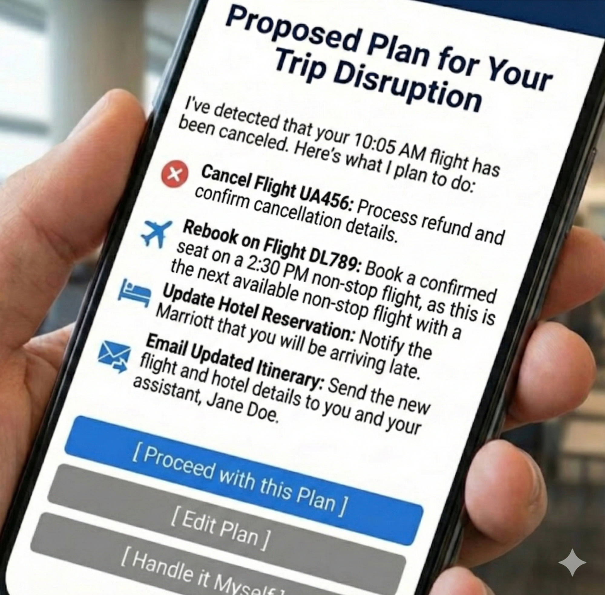
Let’s revisit our travel assistant scenario from the first part of this series. We use this proactive assistant to illustrate how an agent handles a flight cancellation. The agent has detected a flight cancellation and has formulated a recovery plan.

The Intent Preview would look something like this:

Proposed Plan for Your Trip Disruption

I’ve detected that your 10:05 AM flight has been canceled. Here’s what I plan to do:
  1. Cancel Flight UA456
    Process refund and confirm cancellation details.
  2. Rebook on Flight DL789
    Book a confirmed seat on a 2:30 PM non-stop flight, as this is the next available non-stop flight with a confirmed seat.
  3. Update Hotel Reservation
    Notify the Marriott that you will be arriving late.
  4. Email Updated Itinerary
    Send the new flight and hotel details to you and your assistant, Jane Doe.
[ Proceed with this Plan ] [ Edit Plan ] [ Handle it Myself ]

This preview is effective because it provides a complete picture, from cancellation to communication, and offers three distinct paths forward: full consent (Proceed), a desire for modification (Edit Plan), or a full override (Handle it Myself). This multifaceted control is the bedrock of trust.

When to Prioritize This Pattern
This pattern is non-negotiable for any action that is irreversible (e.g., deleting user data), involves a financial transaction of any amount, shares information with other people or systems, or makes a significant change that a user cannot easily undo.

Risk of Omission
Without this, users feel ambushed by the agent’s actions and will disable the feature to regain control.

Metrics for Success:

  • Acceptance Ratio
    Plans Accepted Without Edit / Total Plans Displayed. Target > 85%.
  • Override Frequency
    Total Handle it Myself Clicks / Total Plans Displayed. A rate > 10% triggers a model review.
  • Recall Accuracy
    Percentage of test participants who can correctly list the plan’s steps 10 seconds after the preview is hidden.

Applying This to High-Stakes Domains

While travel plans are a relatable baseline, this pattern becomes indispensable in complex, high-stakes environments where an error results in more than an inconvenience for an individual traveling. Many of us work in settings where wrong decisions may result in a system outage, putting a patient’s safety at risk, or numerous other catastrophic outcomes that unreliable technology would introduce.

Consider a DevOps Release Agent tasked with managing cloud infrastructure. In this context, the Intent Preview acts as a safety barrier against accidental downtime.

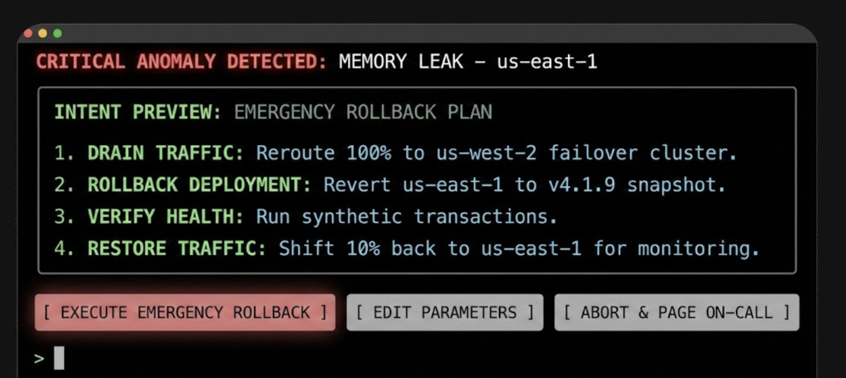
In this interface, the specific terminology (Drain Traffic, Rollback) replaces generalities, and the actions are binary and impactful. The user authorizes a major operational shift based on the agent’s logic, rather than approving a suggestion.

2. The Autonomy Dial: Calibrating Trust With Progressive Authorization

Every healthy relationship has boundaries. The Autonomy Dial is how the user establishes it with their agent, defining what they are comfortable with the agent handling on its own.

Trust is not a binary switch; it’s a spectrum. A user might trust an agent to handle low-stakes tasks autonomously but demand full confirmation for high-stakes decisions. The Autonomy Dial, a form of progressive authorization, allows users to set their preferred level of agent independence, making them active participants in defining the relationship.

Psychological Underpinning
Allowing users to tune the agent’s autonomy grants them a locus of control, letting them match the system’s behavior to their personal risk tolerance.

Implementation
This can be implemented as a simple, clear setting within the application, ideally on a per-task-type basis. Using the taxonomy from our first article, the settings could be:

  • Observe & Suggest
    I want to be notified of opportunities or issues, but the agent will never propose a plan.
  • Plan & Propose
    The agent can create plans, but I must review every one before any action is taken.
  • Act with Confirmation
    For familiar tasks, the agent can prepare actions, and I will give a final go/no-go confirmation.
  • Act Autonomously
    For pre-approved tasks (e.g., disputing charges under $50), the agent can act independently and notify me after the fact.

An email assistant, for example, could have a separate autonomy dial for scheduling meetings versus sending emails on the user’s behalf. This granularity is key, as it reflects the nuanced reality of a user’s trust.

When to Prioritize This Pattern
Prioritize this in systems where tasks vary widely in risk and personal preference (e.g., financial management tools, communication platforms). It is essential for onboarding, allowing users to start with low autonomy and increase it as their confidence grows.

Risk of Omission
Without this, users who experience a single failure will abandon the agent completely rather than simply dialing back its permissions.

Metrics for Success:

  • Trust Density
    Percentage breakdown of users per setting (e.g., 20% Suggest, 50% Confirm, 30% Auto).
  • Setting Churn
    Number of Setting Changes / Total Active Users per month. High churn indicates trust volatility.

3. The Explainable Rationale: Answering Why?

After taking an action, a good partner explains their reasoning. This pattern is the open communication that follows an action, answering Why? before it’s even asked. “I did that because you’ve told me in the past that you prefer X.”

When an agent acts, especially autonomously, the immediate question in the user’s mind is often, Why did it do that? The Explainable Rationale pattern proactively answers this question, providing a concise justification for the agent’s decisions. This is not a technical log file. In my first article of this series, we discussed translating system primitives into user-facing language to prevent deception. This pattern is the practical application of that principle. It transforms the raw logic into a human-readable explanation grounded in the user’s own stated preferences and prior inputs.

Psychological Underpinning
When an agent’s actions are explainable, they feel logical rather than random, helping the user build an accurate mental model of how the agent thinks.

Effective Rationales:

  • Grounded in Precedent
    The best explanations link back to a rule, preference, or prior action.
  • Simple and Direct
    Avoid complex conditional logic. Use a simple “Because you said X, I did Y” structure.

Returning to the travel example, after the flight is rebooked autonomously, the user might see this in their notification feed:

I’ve rebooked your canceled flight.
  • New Flight: Delta 789, departing at 2:30 PM.
  • Why I took this action:
    • Your original flight was canceled by the airline.
    • You’ve pre-approved autonomous rebooking for same-day, non-stop flights.
[ View New Itinerary ] [ Undo this Action ]

The rationale is clear, defensible, and reinforces the idea that the agent is operating within the boundaries the user established.

When to Prioritize This Pattern
Prioritize it for any autonomous action where the reasoning isn’t immediately obvious from the context, especially for actions that happen in the background or are triggered by an external event (like the flight cancellation example).

Risk of Omission
Without this, users interpret valid autonomous actions as random behavior or ‘bugs,’ preventing them from forming a correct mental model.

Metrics for Success:

  • Why? Ticket Volume
    Number of support tickets tagged “Agent Behavior — Unclear” per 1,000 active users.
  • Rationale Validation
    Percentage of users who rate the explanation as ‘Helpful’ in post-interaction microsurveys.

4. The Confidence Signal

This pattern is about the agent being self-aware in the relationship. By communicating its own confidence, it helps the user decide when to trust its judgment and when to apply more scrutiny.

To help users calibrate their own trust, the agent should surface its own confidence in its plans and actions. This makes the agent’s internal state more legible and helps the user decide when to scrutinize a decision more closely.

Psychological Underpinning
Surfacing uncertainty helps prevent automation bias, encouraging users to scrutinize low-confidence plans rather than blindly accepting them.

Implementation:

  • Confidence Score
    A simple percentage (e.g., Confidence: 95%) can be a quick, scannable indicator.
  • Scope Declaration
    A clear statement of the agent’s area of expertise (e.g., Scope: Travel bookings only) helps manage user expectations and prevents them from asking the agent to perform tasks it’s not designed for.
  • Visual Cues
    A green checkmark can denote high confidence, while a yellow question mark can indicate uncertainty, prompting the user to review more carefully.

When to Prioritize This Pattern
Prioritize when the agent’s performance can vary significantly based on the quality of input data or the ambiguity of the task. It is especially valuable in expert systems (e.g., medical aids, code assistants) where a human must critically evaluate the AI’s output.

Risk of Omission
Without this, users will fall victim to automation bias, blindly accepting low-confidence hallucinations, or anxiously double-check high-confidence work.

Metrics for Success:

  • Calibration Score
    Pearson correlation between Model Confidence Score and User Acceptance Rate. Target > 0.8.
  • Scrutiny Delta
    Difference between the average review time of low-confidence plans and high-confidence plans. Expected to be positive (e.g., +12 seconds).

5. The Action Audit & Undo: The Ultimate Safety Net

Trust requires knowing you can recover from a mistake. The Undo function is the ultimate relationship safety net, assuring the user that even if the agent misunderstands, the consequences are not catastrophic.

The single most powerful mechanism for building user confidence is the ability to easily reverse an agent’s action. A persistent, easy-to-read Action Audit log, with a prominent Undo button for every possible action, is the ultimate safety net. It dramatically lowers the perceived risk of granting autonomy.

Psychological Underpinning
Knowing that a mistake can be easily undone creates psychological safety, encouraging users to delegate tasks without fear of irreversible consequences.

Design Best Practices:

  • Timeline View
    A chronological log of all agent-initiated actions is the most intuitive format.
  • Clear Status Indicators
    Show whether an action was successful, is in progress, or has been undone.
  • Time-Limited Undos
    For actions that become irreversible after a certain point (e.g., a non-refundable booking), the UI must clearly communicate this time window (e.g., Undo available for 15 minutes). This transparency about the system’s limitations is just as important as the undo capability itself. Being honest about when an action becomes permanent builds trust.

When to Prioritize This Pattern
This is a foundational pattern that should be implemented in nearly all agentic systems. It is absolutely non-negotiable when introducing autonomous features or when the cost of an error (financial, social, or data-related) is high.

Risk of Omission
Without this, one error permanently destroys trust, as users realize they have no safety net.

Metrics for Success:

  • Reversion Rate
    Undone Actions / Total Actions Performed. If the Reversion Rate > 5% for a specific task, disable automation for that task.
  • Safety Net Conversion
    Percentage of users who upgrade to Act Autonomously within 7 days of successfully using Undo.

6. The Escalation Pathway: Handling Uncertainty Gracefully

A smart partner knows when to ask for help instead of guessing. This pattern allows the agent to handle ambiguity gracefully by escalating to the user, demonstrating a humility that builds, rather than erodes, trust.

Even the most advanced agent will encounter situations where it is uncertain about the user’s intent or the best course of action. How it handles this uncertainty is a defining moment. A well-designed agent doesn’t guess; it escalates.

Psychological Underpinning
When an agent acknowledges its limits rather than guessing, it builds trust by respecting the user’s authority in ambiguous situations.

Escalation Patterns Include:

  • Requesting Clarification
    “You mentioned ‘next Tuesday.’ Do you mean September 30th or October 7th?”
  • Presenting Options
    “I found three flights that match your criteria. Which one looks best to you?”
  • Requesting Human Intervention
    For high-stakes or highly ambiguous tasks, the agent should have a clear pathway to loop in a human expert or support agent. The prompt might be: “This transaction seems unusual, and I’m not confident about how to proceed. Would you like me to flag this for a human agent to review?”

When to Prioritize This Pattern
Prioritize in domains where user intent can be ambiguous or highly context-dependent (e.g., natural language interactions, complex data queries). Use this whenever the agent operates with incomplete information or when multiple correct paths exist.

Risk of Omission
Without this, the agent will eventually make a confident, catastrophic guess that alienates the user.

Metrics for Success:

  • Escalation Frequency
    Agent Requests for Help / Total Tasks. Healthy range: 5-15%.
  • Recovery Success Rate
    Tasks Completed Post-Escalation / Total Escalations. Target > 90%.
Pattern Best For Primary Risk Key Metric
Intent Preview Irreversible or financial actions User feels ambushed >85% Acceptance Rate
Autonomy Dial Tasks with variable risk levels Total feature abandonment Setting Churn
Explainable Rationale Background or autonomous tasks User perceives bugs “Why?” Ticket Volume
Confidence Signal Expert or high-stakes systems Automation bias Scrutiny Delta
Action Audit & Undo All agentic systems Permanent loss of trust <5% Reversion Rate
Escalation Pathway Ambiguous user intent Confident, catastrophic guesses >90% Recovery Success

Table 1: Summary of Agentic AI UX patterns. Remember to adjust the metrics based on your specific domain risk and needs.

Designing for Repair and Redress

This is learning how to apologize effectively. A good apology acknowledges the mistake, fixes the damage, and promises to learn from it.

Errors are not a possibility; they are an inevitability.

The long-term success of an agentic system depends less on its ability to be perfect and more on its ability to recover gracefully when it fails. A robust framework for repair and redress is a core feature, not an afterthought.

Empathic Apologies and Clear Remediation

When an agent makes a mistake, the error message is the apology. It must be designed with psychological precision. This moment is a critical opportunity to demonstrate accountability. From a service design perspective, this is where companies can use the service recovery paradox: the phenomenon where a customer who experiences a service failure, followed by a successful and empathetic recovery, can actually become more loyal than a customer who never experienced a failure at all. A well-handled mistake can be a more powerful trust-building event than a long history of flawless execution.

The key is treating the error as a relationship rupture that needs to be mended. This involves:

  • Acknowledge the Error
    The message should state clearly and simply that a mistake was made.
    Example: I incorrectly transferred funds.
  • State the Immediate Correction
    Immediately follow up with the remedial action.
    Example: I have reversed the action, and the funds have been returned to your account.
  • Provide a Path for Further Help
    Always offer a clear link to human support. This de-escalates frustration and shows that there is a system of accountability beyond the agent itself.

A well-designed repair UI might look like this:

We made a mistake on your recent transfer.
I apologize. I transferred $250 to the wrong account.

✔ Corrective Action: The transfer has been reversed, and your $250 has been refunded.
✔ Next Steps: The incident has been flagged for internal review to prevent it from happening again.

Need further help? [ Contact Support ]
Building the Governance Engine for Safe Innovation

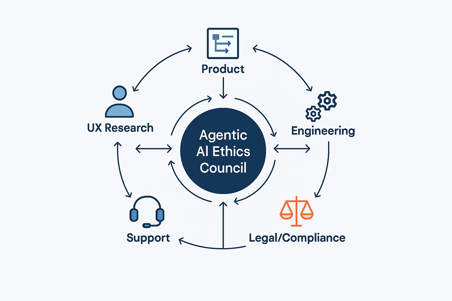
The design patterns described above are the user-facing controls, but they cannot function effectively without a robust internal support structure. This is not about creating bureaucratic hurdles; it is about building a strategic advantage. An organization with a mature governance framework can ship more ambitious agentic features with greater speed and confidence, knowing that the necessary guardrails are in place to mitigate brand risk. This governance engine turns safety from a checklist into a competitive asset.

This engine should function as a formal governance body, an Agentic AI Ethics Council, comprising a cross-functional alliance of UX, Product, and Engineering, with vital support from Legal, Compliance, and Support. In smaller organizations, these ‘Council’ roles often collapse into a single triad of Product, Engineering, and Design leads.

A Checklist for Governance

  • Legal/Compliance
    This team is the first line of defense, ensuring the agent’s potential actions stay within regulatory and legal boundaries. They help define the hard no-go zones for autonomous action.
  • Product
    The product manager is the steward of the agent’s purpose. They define and monitor its operational boundaries through a formal autonomy policy that documents what the agent is and is not allowed to do. They own the Agent Risk Register.
  • UX Research
    This team is the voice of the user’s trust and anxiety. They are responsible for a recurring process for running trust calibration studies, simulated misbehavior tests, and qualitative interviews to understand the user’s evolving mental model of the agent.
  • Engineering
    This team builds the technical underpinnings of trust. They must architect the system for robust logging, one-click undo functionality, and the hooks needed to generate clear, explainable rationales.
  • Support
    These teams are on the front lines of failure. They must be trained and equipped to handle incidents caused by agent errors, and they must have a direct feedback loop to the Ethics Council to report on real-world failure patterns.

This governance structure should maintain a set of living documents, including an Agent Risk Register that proactively identifies potential failure modes, Action Audit Logs that are regularly reviewed, and the formal Autonomy Policy Documentation.

Where to Start: A Phased Approach for Product Leaders

For product managers and executives, integrating agentic AI can feel like a monumental task. The key is to approach it not as a single launch, but as a phased journey of building both technical capability and user trust in parallel. This roadmap allows your organization to learn and adapt, ensuring each step is built on a solid foundation.

Phase 1: Foundational Safety (Suggest & Propose)

The initial goal is to build the bedrock of trust without taking significant autonomous risks. In this phase, the agent’s power is limited to analysis and suggestion.

  • Implement a rock-solid Intent Preview: This is your core interaction model. Get users comfortable with the idea of the agent formulating plans, while keeping the user in full control of execution.
  • Build the Action Audit & Undo infrastructure: Even if the agent isn’t acting autonomously yet, build the technical scaffolding for logging and reversal. This prepares your system for the future and builds user confidence that a safety net exists.

Phase 2: Calibrated Autonomy (Act with Confirmation)

Once users are comfortable with the agent’s proposals, you can begin to introduce low-risk autonomy. This phase is about teaching users how the agent thinks and letting them set their own pace.

  • Introduce the Autonomy Dial with limited settings: Start by allowing users to grant the agent the power to Act with Confirmation.
  • Deploy the Explainable Rationale: For every action the agent prepares, provide a clear explanation. This demystifies the agent’s logic and reinforces that it is operating based on the user’s own preferences.

Phase 3: Proactive Delegation (Act Autonomously)

This is the final step, taken only after you have clear data from the previous phases demonstrating that users trust the system.

  • Enable Act Autonomously for specific, pre-approved tasks: Use the data from Phase 2 (e.g., high Proceed rates, low Undo rates) to identify the first set of low-risk tasks that can be fully automated.
  • Monitor and Iterate: The launch of autonomous features is not the end, but the beginning of a continuous cycle of monitoring performance, gathering user feedback, and refining the agent’s scope and behavior based on real-world data.
Design As The Ultimate Safety Lever

The emergence of agentic AI represents a new frontier in human-computer interaction. It promises a future where technology can proactively reduce our burdens and streamline our lives. But this power comes with profound responsibility.

Autonomy is an output of a technical system, but trustworthiness is an output of a design process. Our challenge is to ensure that the user experience is not a casualty of technical capability but its primary beneficiary.

As UX professionals, product managers, and leaders, our role is to act as the stewards of that trust. By implementing clear design patterns for control and consent, designing thoughtful pathways for repair, and building robust governance frameworks, we create the essential safety levers that make agentic AI viable. We are not just designing interfaces; we are architecting relationships. The future of AI’s utility and acceptance rests on our ability to design these complex systems with wisdom, foresight, and a deep-seated respect for the user’s ultimate authority.

Student names in language classes

Feb. 11th, 2026 01:59 am
[syndicated profile] languagelog_feed

Posted by Victor Mair

From Barbars Phillips Long:

A Reddit thread beginning with a complaint from a student taking Spanish at a U.S. high school hinges on whether the teacher should call the student by his preferred name in English or translate it into Spanish. I never really thought about the practice of using or assigning Spanish names in Spanish class, or French names in French class, even though I did not have a French name in French class (possibly because my junior high French teacher was Puerto Rican and my high school teacher was a Hungarian refugee who had studied at the Sorbonne). But since I was in high school in the 1960s, sensitivity about names, naming, pronunciation of names, "dead names," and other assorted naming issues are a much more prominent part of advice/grievance columns and forums.

There seem to be two teaching approaches to renaming. One is to translate or change the pronunciation, which this student is unhappy with. The other style is to allow each student to choose a new name for themselves, probably from a curated list; some teens really like having the alternate name.
 
I don't think the details of the Reddit debate are necessary here, but it did make me curious about a few things:
 
Where did this renaming practice originate and is it part of teacher training in some or all states?
 
Why does it appear to be a U.S. phenomenon? (Students commenting from the U.K. and other countries say they are not renamed in foreign language classes.)
 
Is renaming a practice in U.S. high school classes in Mandarin or other non-Romance languages? 
 
Is renaming a practice in U.S. college classes in foreign languages?
 
Do teachers, as a standard practice, rename students in English in ESL classes in the U.S. or overseas?
 
For those who are curious, the student complaining said that he is called by his initials, J.P., and he wants his Spanish teacher to pronounce them in English instead of using the Spanish pronunciation for the letters.

(Here's the Reddit thread.)

Most of my Chinese students have English names which, in many cases, they adopted or were granted already in elementary school, middle school, or high school, and over the years became quite fond of their English name. A minority staunchly cling to their Chinese names, and would consider it a betrayal of their ethnicity to switch to a foreign name.  Quite a few tell me that they switch to an English name because their teachers and classmates can't pronounce their Chinese names.  I should also mention that a large proportion of foreigners studying Chinese languages think it's cool to take a Chinese name, makes them feel more Chinese, and they stick to their Chinese for their whole life.  Often, one of the first things teachers of first-year Chinese do is endow their students with a Chinese name, which many of the students think imparts a Chinese personality / character to them.  My name, for example Méi Wéihéng 梅維恒 ("Plum Preserve / Maintain / Safeguard  Constant / Unchanging / Immutable"), thoughtfully bestowed upon me by Tang Haitao and Yuan Naiying, gifted Princeton teachers, corresponds well with the sound and meaning of my name.

Far fewer of my Japanese students adopt an English name, perhaps because Japanese names seem easier to pronounce than Chinese names (vowels and consonants are straightforward, no tones to contend with, can spell them readily in romaji, etc.)


Selected readings

denise: Image: Me, facing away from camera, on top of the Castel Sant'Angelo in Rome (Default)
[staff profile] denise posting in [site community profile] dw_news
Back in August of 2025, we announced a temporary block on account creation for users under the age of 18 from the state of Tennessee, due to the court in Netchoice's challenge to the law (which we're a part of!) refusing to prevent the law from being enforced while the lawsuit plays out. Today, I am sad to announce that we've had to add South Carolina to that list. When creating an account, you will now be asked if you're a resident of Tennessee or South Carolina. If you are, and your birthdate shows you're under 18, you won't be able to create an account.

We're very sorry to have to do this, and especially on such short notice. The reason for it: on Friday, South Carolina governor Henry McMaster signed the South Carolina Age-Appropriate Design Code Act into law, with an effective date of immediately. The law is so incredibly poorly written it took us several days to even figure out what the hell South Carolina wants us to do and whether or not we're covered by it. We're still not entirely 100% sure about the former, but in regards to the latter, we're pretty sure the fact we use Google Analytics on some site pages (for OS/platform/browser capability analysis) means we will be covered by the law. Thankfully, the law does not mandate a specific form of age verification, unlike many of the other state laws we're fighting, so we're likewise pretty sure that just stopping people under 18 from creating an account will be enough to comply without performing intrusive and privacy-invasive third-party age verification. We think. Maybe. (It's a really, really badly written law. I don't know whether they intended to write it in a way that means officers of the company can potentially be sentenced to jail time for violating it, but that's certainly one possible way to read it.)

Netchoice filed their lawsuit against SC over the law as I was working on making this change and writing this news post -- so recently it's not even showing up in RECAP yet for me to link y'all to! -- but here's the complaint as filed in the lawsuit, Netchoice v Wilson. Please note that I didn't even have to write the declaration yet (although I will be): we are cited in the complaint itself with a link to our August news post as evidence of why these laws burden small websites and create legal uncertainty that causes a chilling effect on speech. \o/

In fact, that's the victory: in December, the judge ruled in favor of Netchoice in Netchoice v Murrill, the lawsuit over Louisiana's age-verification law Act 456, finding (once again) that requiring age verification to access social media is unconstitutional. Judge deGravelles' ruling was not simply a preliminary injunction: this was a final, dispositive ruling stating clearly and unambiguously "Louisiana Revised Statutes §§51:1751–1754 violate the First Amendment of the U.S. Constitution, as incorporated by the Fourteenth Amendment of the U.S. Constitution", as well as awarding Netchoice their costs and attorney's fees for bringing the lawsuit. We didn't provide a declaration in that one, because Act 456, may it rot in hell, had a total registered user threshold we don't meet. That didn't stop Netchoice's lawyers from pointing out that we were forced to block service to Mississippi and restrict registration in Tennessee (pointing, again, to that news post), and Judge deGravelles found our example so compelling that we are cited twice in his ruling, thus marking the first time we've helped to get one of these laws enjoined or overturned just by existing. I think that's a new career high point for me.

I need to find an afternoon to sit down and write an update for [site community profile] dw_advocacy highlighting everything that's going on (and what stage the lawsuits are in), because folks who know there's Some Shenanigans afoot in their state keep asking us whether we're going to have to put any restrictions on their states. I'll repeat my promise to you all: we will fight every state attempt to impose mandatory age verification and deanonymization on our users as hard as we possibly can, and we will keep actions like this to the clear cases where there's no doubt that we have to take action in order to prevent liability.

In cases like SC, where the law takes immediate effect, or like TN and MS, where the district court declines to issue a temporary injunction or the district court issues a temporary injunction and the appellate court overturns it, we may need to take some steps to limit our potential liability: when that happens, we'll tell you what we're doing as fast as we possibly can. (Sometimes it takes a little while for us to figure out the exact implications of a newly passed law or run the risk assessment on a law that the courts declined to enjoin. Netchoice's lawyers are excellent, but they're Netchoice's lawyers, not ours: we have to figure out our obligations ourselves. I am so very thankful that even though we are poor in money, we are very rich in friends, and we have a wide range of people we can go to for help.)

In cases where Netchoice filed the lawsuit before the law's effective date, there's a pending motion for a preliminary injunction, the court hasn't ruled on the motion yet, and we're specifically named in the motion for preliminary injunction as a Netchoice member the law would apply to, we generally evaluate that the risk is low enough we can wait and see what the judge decides. (Right now, for instance, that's Netchoice v Jones, formerly Netchoice v Miyares, mentioned in our December news post: the judge has not yet ruled on the motion for preliminary injunction.) If the judge grants the injunction, we won't need to do anything, because the state will be prevented from enforcing the law. If the judge doesn't grant the injunction, we'll figure out what we need to do then, and we'll let you know as soon as we know.

I know it's frustrating for people to not know what's going to happen! Believe me, it's just as frustrating for us: you would not believe how much of my time is taken up by tracking all of this. I keep trying to find time to update [site community profile] dw_advocacy so people know the status of all the various lawsuits (and what actions we've taken in response), but every time I think I might have a second, something else happens like this SC law and I have to scramble to figure out what we need to do. We will continue to update [site community profile] dw_news whenever we do have to take an action that restricts any of our users, though, as soon as something happens that may make us have to take an action, and we will give you as much warning as we possibly can. It is absolutely ridiculous that we still have to have this fight, but we're going to keep fighting it for as long as we have to and as hard as we need to.

I look forward to the day we can lift the restrictions on Mississippi, Tennessee, and now South Carolina, and I apologize again to our users (and to the people who temporarily aren't able to become our users) from those states.

Collabga

Feb. 10th, 2026 05:08 pm
[syndicated profile] urban_feed
‘Collabga’ is a term used by Stan Twitter to cope with [Lady Gaga]’s immense success, [particularly] through collaborations with artists such as [Ariana Grande], Bruno Mars, and BLACKPINK.

AI teaches spoken English in Taiwan

Feb. 10th, 2026 12:33 am
[syndicated profile] languagelog_feed

Posted by Victor Mair

Taiwan education ministry adds AI to English speaking test:
New system gives students instant feedback on spoken English
Lai Jyun-tang, Taiwan News | Feb. 3, 2026

Is this a first in the whole world?  Or is it already common in many countries?

The article includes links to various Ministry resources providing background (in Mandarin).
 
AntC says he'd be very interested to hear from LLog readers involved with teaching/examining English using this tool.

TAIPEI (Taiwan News) — Taiwan’s education ministry has added artificial intelligence to its English speaking assessment system to help students better learn and practice spoken English.

Liberty Times reported Monday that the upgraded system uses artificial intelligence to score pronunciation and analyze spoken answers in real time. Education officials said the move supports Taiwan’s 2030 bilingual policy by placing greater emphasis on practical communication skills.

Tsai I-ching (蔡宜靜), a division chief at the ministry’s K-12 Education Administration, said the system is free for students from elementary school to university and covers listening, speaking, reading, and writing. She said the new speaking tasks include open-ended questions and information-based responses to mirror real-life situations and international test formats.

The system evaluates pronunciation accuracy, fluency, rhythm, vocabulary use, grammar, and how well responses match the question, according to the education ministry. After each test, students receive instant, personalized feedback and learning suggestions, the ministry said.

At Changhua County’s Shengang Junior High School, students use the system to practice speaking beyond textbook exercises and gain a clearer understanding of their strengths and weaknesses. Teachers also guide students to use the feedback to refine pronunciation and sentence structure.

In Keelung City, Cheng Kung Junior High School applies the test results to build a learning cycle that links assessment, feedback, and improvement. The approach has helped boost student motivation and engagement, per CNA.


Selected readings

[syndicated profile] languagelog_feed

Posted by Victor Mair


The Lotus Sutra, on which Nichiren Buddhism is based, was composed in written form in an India language between the 1st century BC and the 2nd century AD.  It was translated into Chinese by Dharmarakṣa's team already in 286 AD and reached Japan by the 6th century (traditionally 538 CE) from Korea.


Selected readings

[Thanks to Geoff Wade]